Educational disclaimer. The method is described by analogy; the papers cited under each claim carry the scientific detail. Service limits, free tiers and hardware names are snapshots from the day this was written and will drift. Treat the Kipu Quantum Hub and the linked papers as the single sources of truth.
1. Place the quantum part
Why the processor belongs in the training path only, and what that means for serving.
2. See which models gain
The controlled experiment: fed the expert's features it beats them, denied them it finds nothing.
3. Judge the evidence
The single-split trap, out-of-fold scoring with correction, and what the published results support.
The model you have already tuned flat
Somewhere in your organisation there is a machine learning model that someone defends in a monthly review. It scores credit applications, or flags a machine before it fails, or ranks compounds before the lab spends a week to synthesise them. It works. It has worked for two years. And over the last four quarters nobody was able to improve its accuracy.
The obvious things don't work anymore: more capacity, more trees, a longer hyperparameter search, class weights, calibration. Each pass costs a week for marginal gains. That is a signal that the constraint is no longer the model and rather sits in how the data is presented. Your plateau is a re-presentation limit, not a tuning limit.
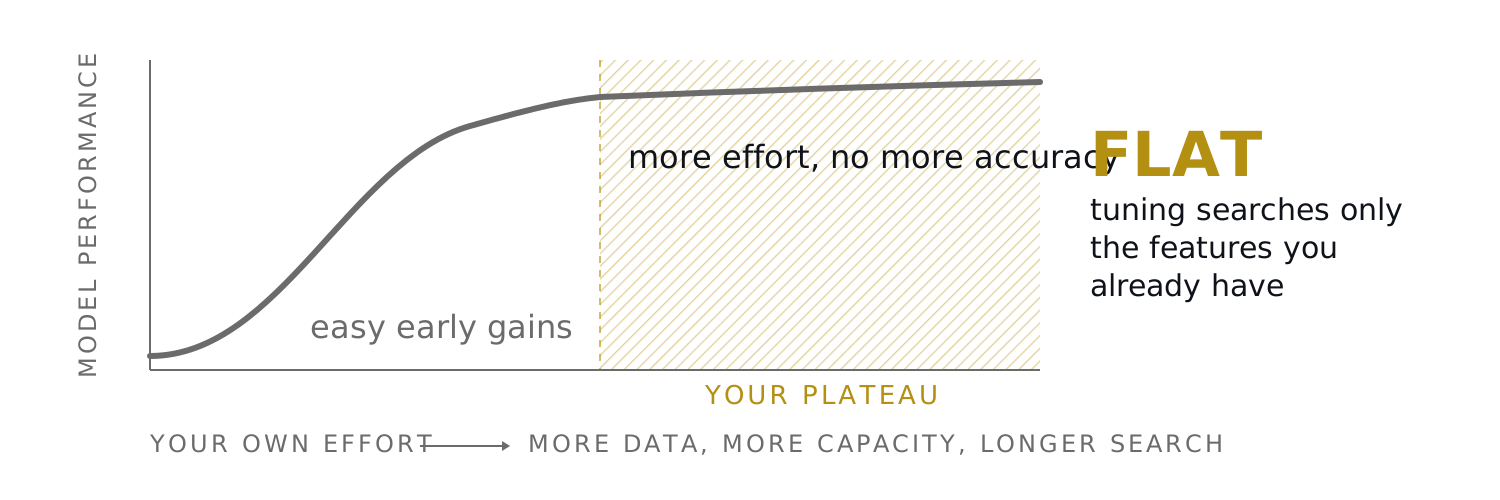
This session introduces an instrument built for those cases: Kipu's Rimay service, which computes extra input columns for a model you already tuned flat. However, it does not remove the tuning work, it can help ML models digest the data better. Over the last year we have seen Rimay work particularly well for problems where training data is rare.
For example four hundred failures recorded in nine years, the ninety toxic compounds, the few customers with high churn intent, the hundred defaults in a portfolio of overwhelmingly good loans. You can subscribe to it on the Kipu Quantum Hub Marketplace.
How does it work, where's the quantum computer?
First up: Using Rimay, your production system will not depend on a quantum computer. It is needed only for the training phase. Inference stays classical afterwards. Quantum machine learning is the use of a quantum processor inside a machine-learning pipeline. Whether to represent the data, to fit the model, or to make the prediction. Rimay, also called digitized quantum feature extraction, falls in the first category. It writes existing data columns onto qubits and returns quantum fit transform measurements for ordinary machine learning models.
quan·tum ma·chine learn·ing
/ˈkwɒn.təm məˈʃiːn ˈlɜː.nɪŋ/noun
- 1
the use of a quantum processor somewhere inside a machine-learning pipeline, whether to represent the data, to fit the model, or to make the prediction.
End-to-end quantum machine learning would put a processor in the pipeline. So every training, every inference waits in a hardware queue on the cloud. That is unusable in industry: latency measured in minutes rather than milliseconds, on-premise policy prohibits cloud usage in production. Feature extraction can put the quantum processor in the training path only. Slow, scheduled, expensive compute during training is something organisations already tolerate. If required, a surrogate, a small classical model trained to reproduce the quantum output, extracts the performance gains and makes them usable. More on that later.
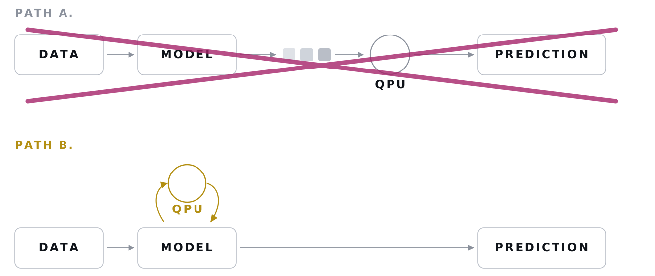
Here's how Rimay works: raw data, scarce and expensive to label, goes into the quantum feature extraction service, which returns enriched columns. Your existing scikit-learn, XGBoost or PyTorch models consume them alongside existing data. Your model and stack remain mostly unchanged with one additional API call in between.
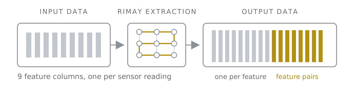
The encoding uses one qubit per feature. Nine columns (we call them features) of a predictive-maintenance tabular dataset are mapped onto nine qubits. Each feature's value sets that qubit's bias. Quantum columns come back: one measured value per qubit, plus feature-pair fit transforms. The free simulator allows usage for up to fifteen features on the input dataset. Paid services allow usage on real quantum computers with up to 156 features.
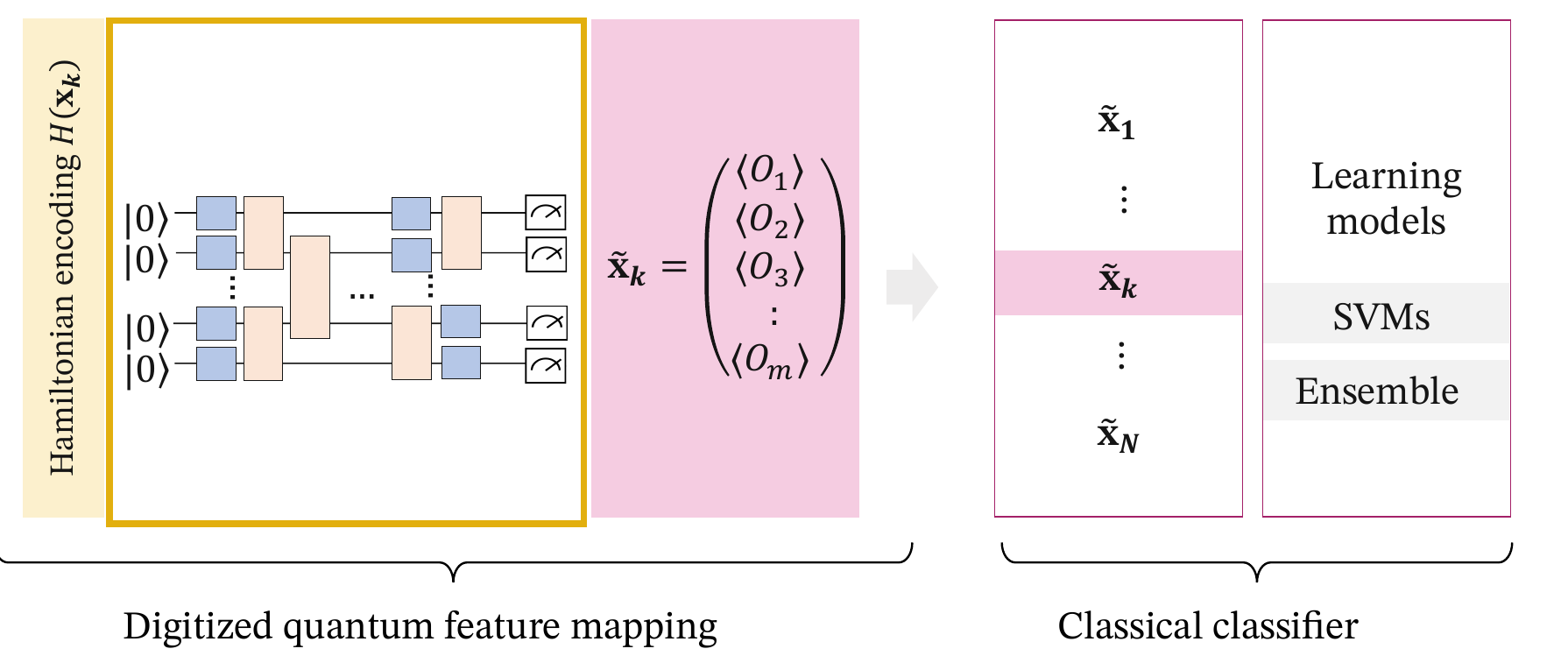
In a nutshell, Rimay re-presents structure in a form models can digest better if mixed with the original columns. It does not engineer data, or recover missing information. Overall these fit transforms help mostly with feature separation. Whether a model can use the re-presentation is a separate question and is one that we discover in the following paragraphs.
Which models improve in performance?
An important question, and perhaps the biggest misconception about Rimay is that it replaces tuning work of a data engineer. To investigate whether that is the case, we start two Rimay extractions on the same 3,000 rows of AI4I 2020, a public predictive-maintenance benchmark. All other things being equal (same split), only one of Rimay's inputs contained the three additional features a domain expert had hand-built: temperature difference, power and overstrain features.
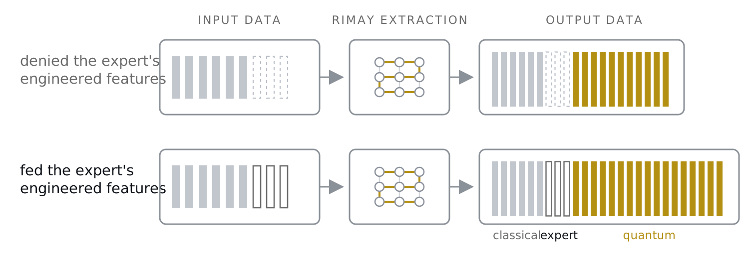
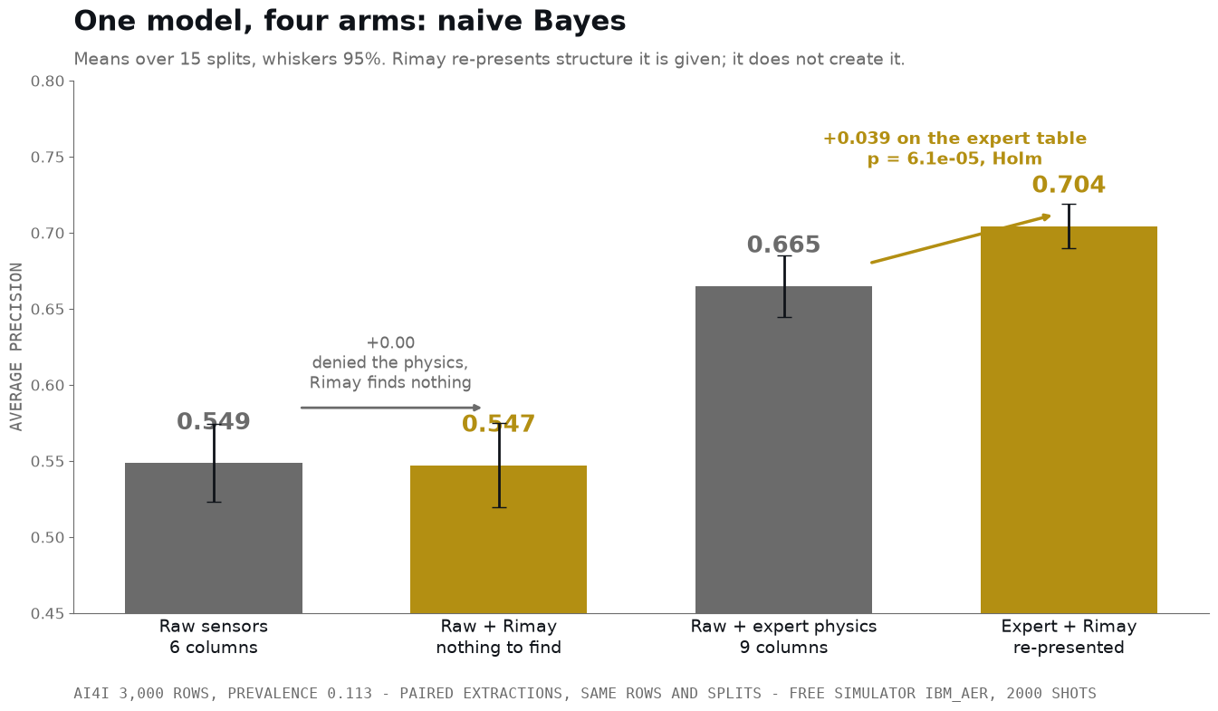
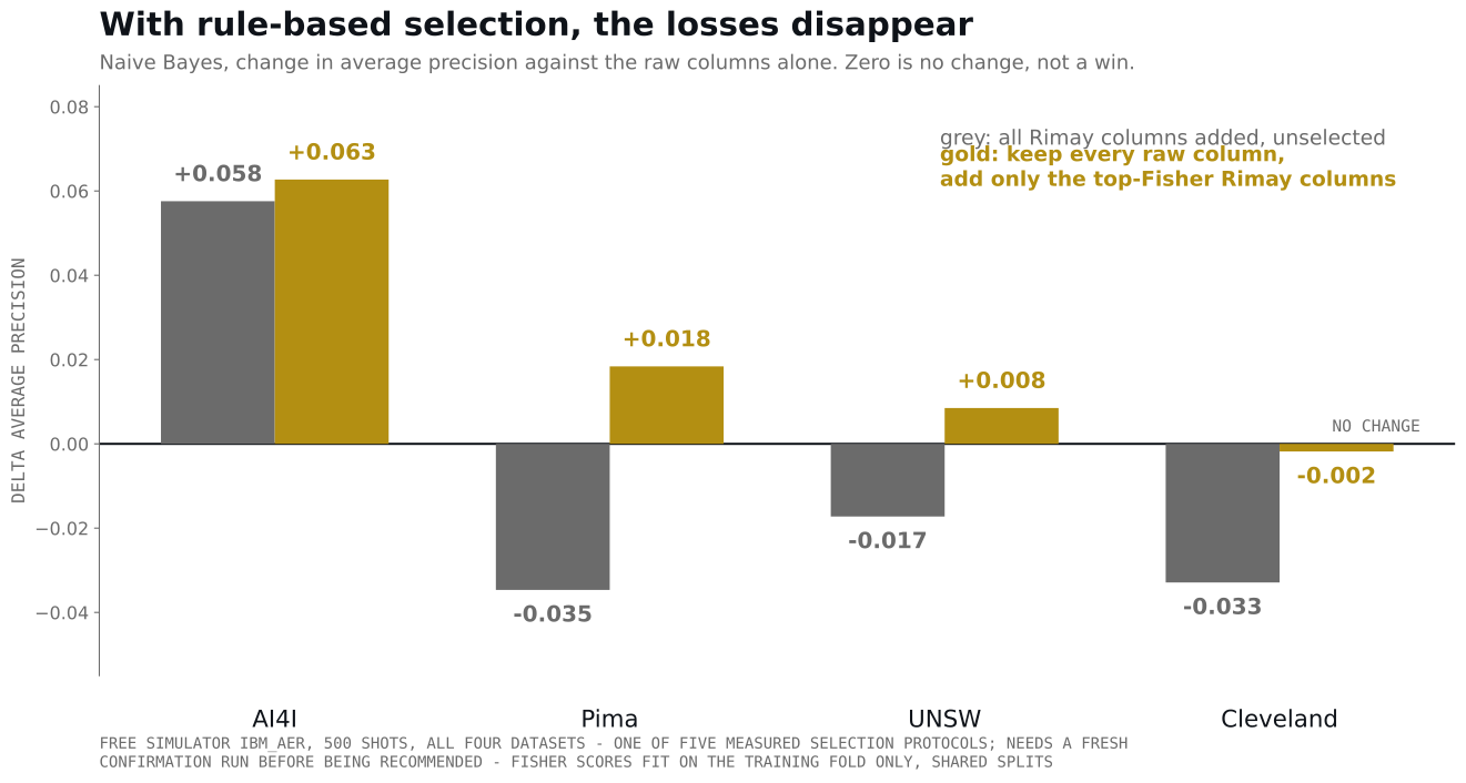
Denied the expert features, no model shows a significant gain. Fed them, the re-presentation improves the expert's data further for Naive Bayes. Gains: +0.0394 average precision over the expert-augmented table itself, at p 6.1e-05 after Holm correction, that means the result is statistically significant (p<0.05). This improvement does not hold for all models. Logistic regression: +0.0180. Linear SVM: no effect. RBF-kernel SVM: -0.0506. Gradient boosting: -0.0476. We can recover the losses with intelligent feature selection later.
And this comes at no surprise: a well known effect that predates quantum computers. For interested readers, the following study generated sixteen families of engineered features and measured how well four regression models deal with them; random forests and gradient boosting work well on their own, having most benefit from only three (arXiv:1701.07852, v2, 2020). That also means that models require different tuning. If you want to investigate the tradeoffs in more detail you will look at a so-called PR-curve. This has nothing to do with marketing and everything with how well a model predicts outcomes under different settings.
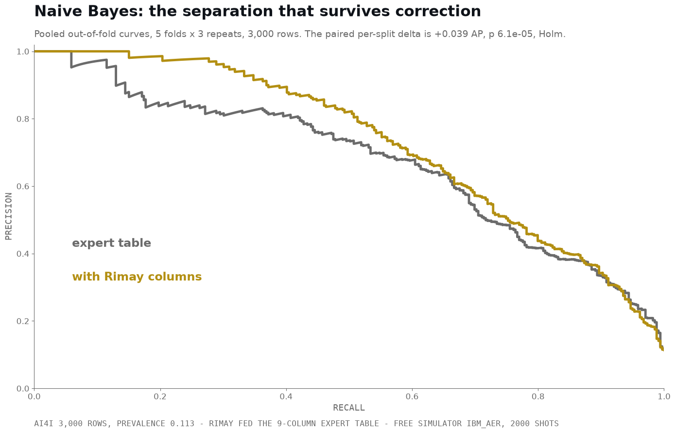
Separation between the grey and yellow line is benefit or loss from the quantum features. Upper right means higher performance. Captured here is Recall (don't overlook anything) against Precision (avoid false alarms). ML models can run at different thresholds. If you want absolutely no false negatives you will need to run at high Recall thresholds which incentivise the model to label far more data as positives, at the cost of a lot of false alarms. At high precision thresholds you want the system to only ring the alarm when it is 100% certain. This comes at the expense of recall. The right setting sits somewhere in between. Depending on your threshold needs, the curve separation can be larger or smaller even for the same model and the same dataset.
Decision Logic: In this instance the cost of false positives and false negatives is highly asymmetric and the positive class is rare. Therefore the PR-curve is the appropriate metric to use. For a balanced dataset you'd go with a ROC-curve analysis (read more here).
Which datasets work well with Rimay?
To illustrate both gains and losses, this section discusses three datasets: AI4I (predictive maintenance), Pima (diabetes), UNSW-NB15 (network intrusion). After closer inspection it becomes clear that AI4I is the only table of the four that carried structure for the extraction to re-present.
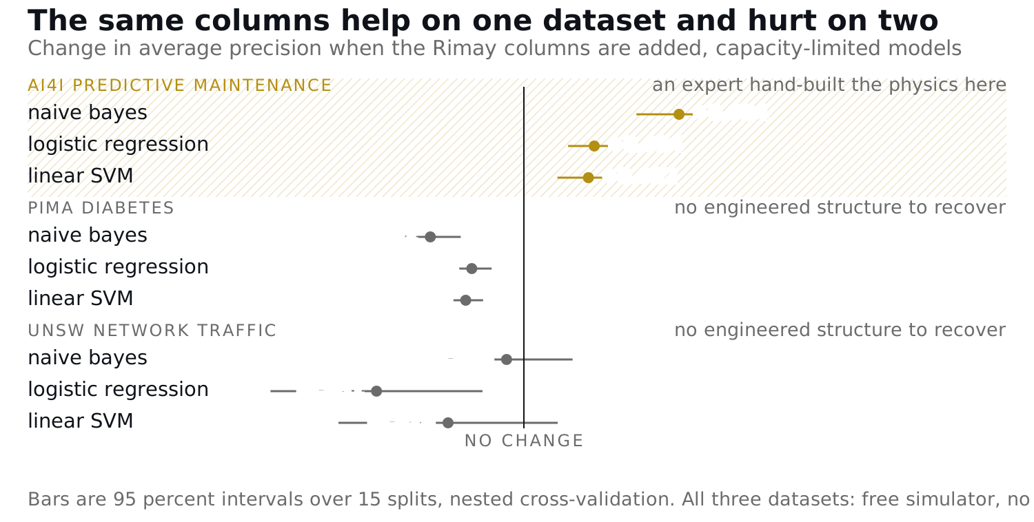
As you can see, Rimay is not a magic wand, but rather based on traceable data transformations. Measured gains are largest on a table that already carries structure, and losses appear on ones that do not. We just completed step 1 of 4 to determine whether we got a hit:
- Measure performance on raw Classical+Quantum features.
- Apply a Feature Selection Protocol to repair the losses.
- Perform a PR or ROC-Curve Analysis.
- Test for Statistical Significance.
Extracting gains with the Rimay simulator is considerably more difficult than with its larger quantum hardware counterpart. Limited size and inherent limited complexity of the small feature counts make it hard, yet not prohibitive to find gains.
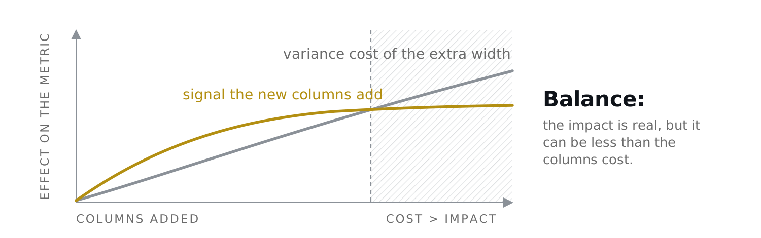
Feature Selection (Step 2)
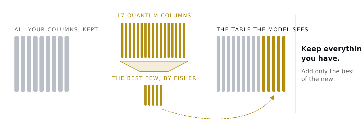
Using only training data an inner cross-validation decides which columns to keep. The so called Fisher score measures the variance of features depending on their class. High values are achieved if the within-class variance is low and the cross-class difference is large. That means features that separate classes well achieve higher scores than those that blur the lines. Other feature selection methods exist.
Performance Curve Analysis (Step 3)
Once you have applied steps 1 and maybe 2, sometimes the perfomance score will improve and it is right to ask whether what you just observed is quantum advantage. That argument requires a little more nuance and background checks. Quantum Advantage carries a lot of importance and meaning in the world of computation and as soon as you will announce it, many will try to dispute it. The following two sections Step 3 and 4 will serve as an initial guide that help you determine whether a result is significant for your application. But at the same time, keep in mind that the ultimate end goal is industrial usefulness. So if it works for you and saves money effort or time, use it, and don't waste too much thought on artificial debates.
The following data comes from one held-out split of 140 carrying 50 failures of the AI4I training dataset, using logistic regression. From initial analysis failure-class F1 moves 4pp from 0.740 to 0.780. Accuracy improves by 2.9 points. Looking at the PR-plot: both curves sit nearly on top of each other on average. So where does the lift come from? An important lesson: Metrics you care about can still differ usefully for your application.
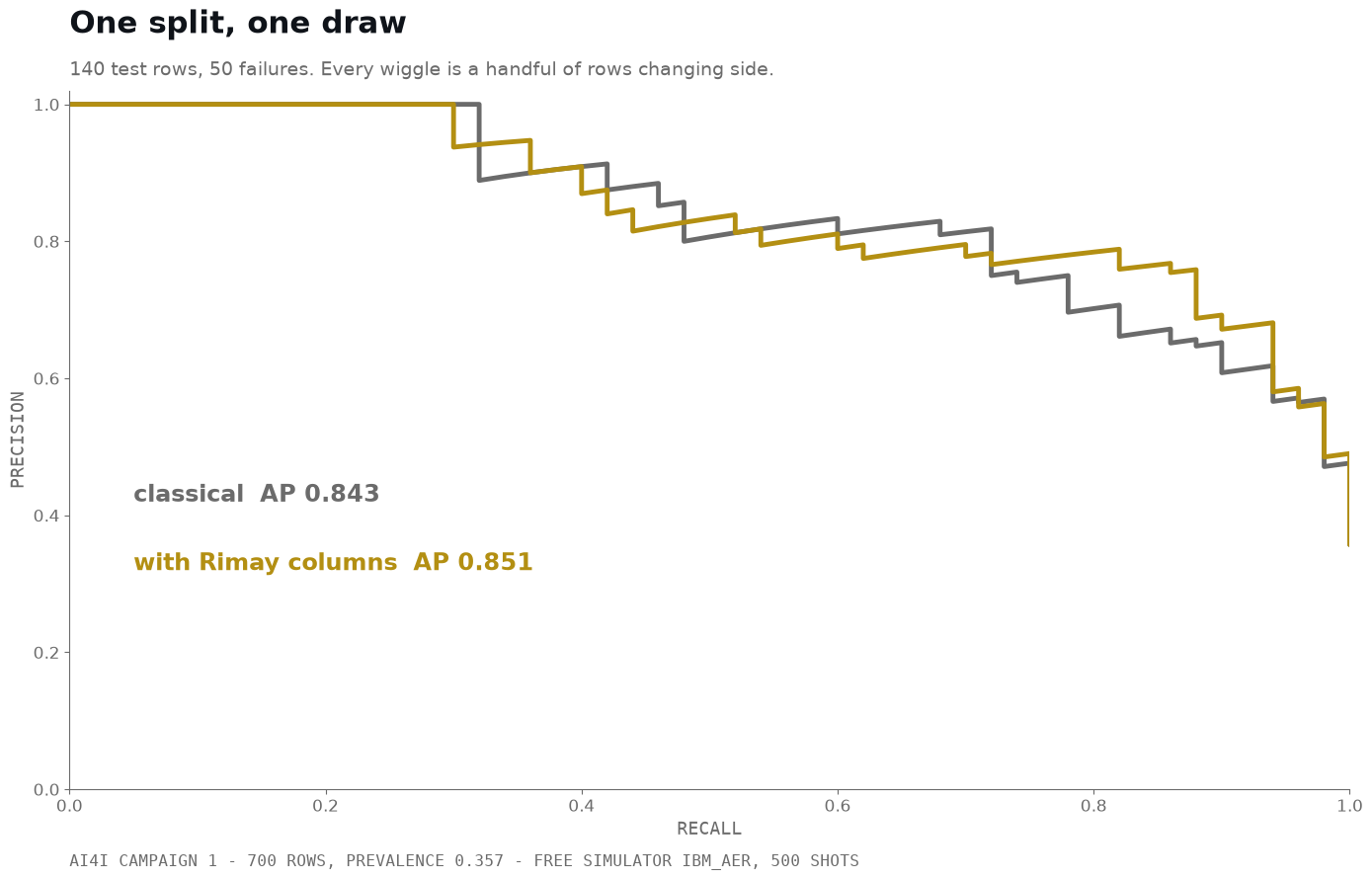
Specific applications do not consume the average of a PR or ROC-curve. F1 and accuracy measure after you have chosen a threshold. Rimay's extracted features might help with separation in a certain threshold region, while providing less benefit in another. Depending on your application you can tune your thresholds: high recall settings apply when a false negative costs several times more than a false alarm. You then fix recall at, say, 0.8 and tune for maximum precision at that setting.
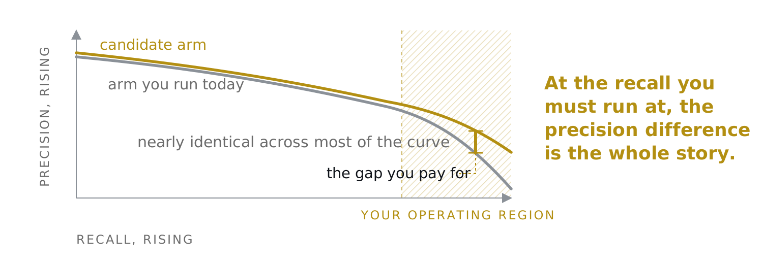
So determine your curve region-first: fix the recall your cost structure demands, read off the precision there, and price the difference in. While on the run above that reading was not significant either way, the point is the method. A whole-curve average can undersell or oversell a model for your specific decision.
Fair comparison of models
Machine Learning models are statistical and you can get a high performing model from structural advantage or just by luck. To determine whether we got structural advantage we analyse statistical significance with a McNemar test. Here classical and quantum models go head to head. Datapoints only the classical model got right award points to that model and inversely those only the hybrid did get right add to its points. Rows both models got right or both got wrong drop out; the two remaining scores provide the p-value.
In general:
- p>0.05 not significant.
- p<0.05 significant results.
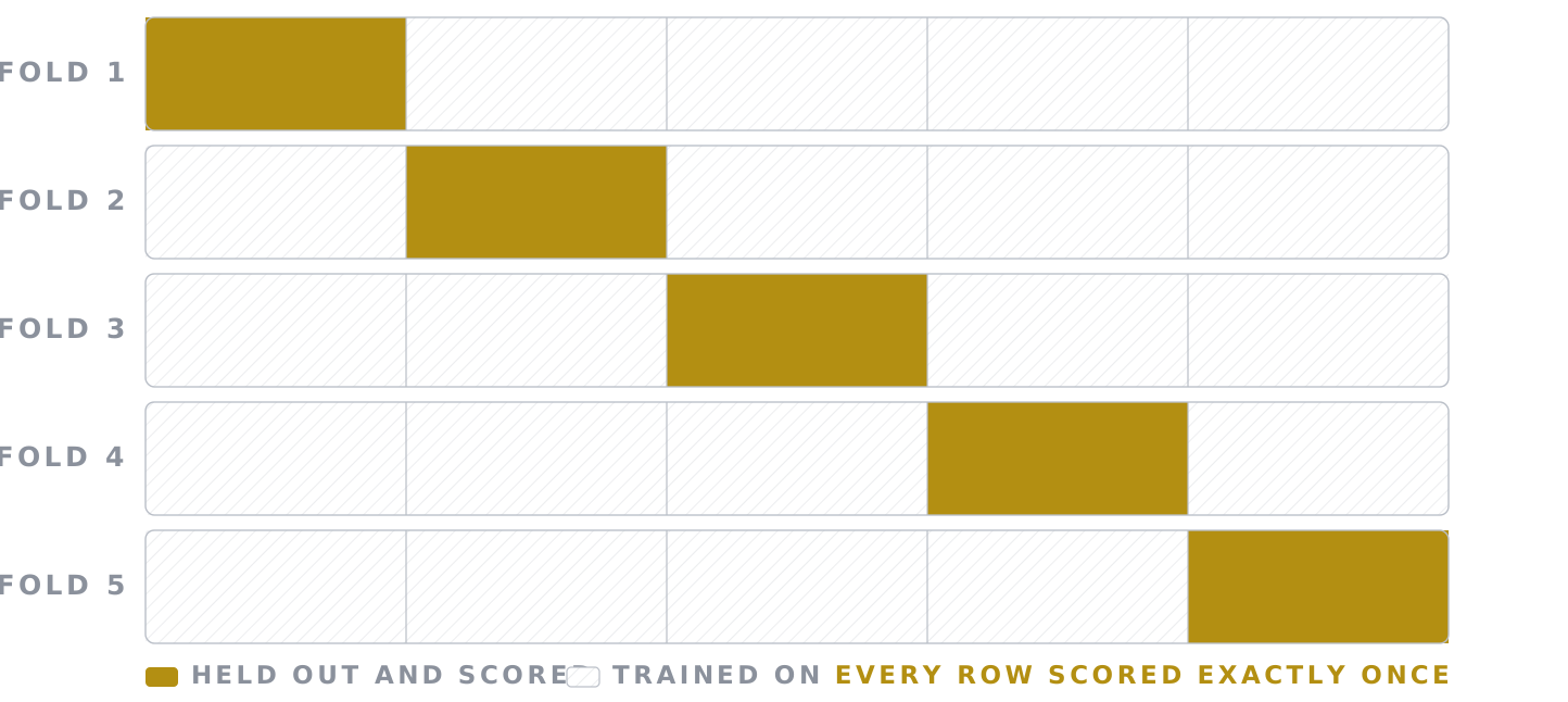
A lot of times, if you use an 80/20 split, you only ever test on 20 percent of data at low statistical significance. Most of your data goes into training and is never scored and can provide the necessary statistics for more accurate p-values. Predicting every row exactly once, out of fold, from a model that never saw it, unlocks the entire dataset. By doing so, you also have to correct for the fact that you tried several models with a Holm correction. To give you a perspective, with five candidates, the chance that one of them clears p = 0.05 by luck alone is roughly one in four. Holm correction prevents luck reported as a result.
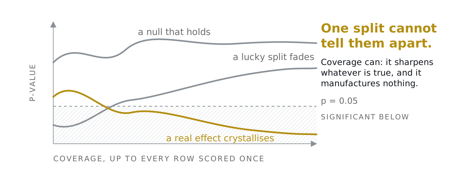
Throughout your training and test splits you will see that the p-value can rise and fall with increasing coverage. Dataset coverage sharpens our understanding. If it is bouncing around, the results are likely insignificant, on the other hand insignificant results can turn out to show real impact and vice versa. Overall more data is usually better, but not always available. Many situations will require you to make decisions with only 70% of the understanding rather than 90%. It becomes important that you differentiate between those that are easily reversible with high upside and those that might need further investigation before forming a recommendation.
Why the resampling is over folds
The obvious way to put an interval on an out-of-fold score is to bootstrap the rows: resample the predictions with replacement a few thousand times and read off the spread. It is wrong here, and Kipu's own evaluation pipeline states why: out-of-fold rows within a fold share a fitted model, so they are not independent draws, and resampling them as if they were inflates the apparent sample size and therefore the significance. Row-level tests on paired per-row losses show the same failure, returning vanishingly small p-values for comparisons that a paired test at the fold level shows to have little if no gap at all.
The fix is to resample whole folds, so the unit of resampling is the unit that carries an independently fitted model, and to use a variance-corrected paired test built for repeated cross-validation, where the training sets of different folds overlap. Holm-Bonferroni then runs across the whole family of comparisons rather than each one alone. If a vendor cannot tell you what their resampling unit was, the metrics they are quoting needs to be taken with a grain of salt.
A successful and durable pilot looks roughly like this: enough positives that fold-to-fold variance is smaller than the effect you want, out-of-fold prediction rather than one single split, and a correction that accounts for luck and the number of tests.
Published evidence for further reading
Result
Breast tumour detection, MedMNIST ultrasound, 702 samples, images reduced classically to 202 variables and then to 156, IBM ibm_kingston hardware at 156 qubits, support-vector classifier on the 156 SHAP-selected variables of which 109 are quantum-derived
Reported
AUC 0.937 on the benchmark's predefined test split
Baseline compared against
- the same classifier on the classical variables alone 0.887
- Google AutoML Vision 0.919
- ResNet-18 0.891
- AutoKeras 0.871
- ResNet-50 0.866
- Auto-sklearn 0.836
Result
Molecular toxicity classification, 171 molecules by 156 descriptors, one qubit per descriptor on the same 156-qubit hardware, gradient boosting under 5x5 repeated stratified cross-validation, 25 test sets
Reported
+121% in precision for the combined classical plus quantum feature set, relative, with no absolute precision published either side
Baseline compared against
- the same gradient boosting on the 156 classical descriptors alone, which is how the paper's abstract and conclusion frame the comparison
- no third-party model reported for this dataset
- no absolute precision published either side
Result
Aerial tree-genus classification, balanced five-class TreeSatAI subset, 1,000 training and 200 test images, random forest on features reduced to each backend's qubit width, three IBM Heron processors plus the ibm_aer simulator
Reported
best 87.0%, from the quantum-only feature set on ibm_pittsburgh run at 120 of its 156 qubits; the hybrid set reached 86.5% on both 120-qubit backends and 81.5% on the 156-qubit one
Baseline compared against
- ResNet-50 features plus a random forest at 84.0% on 120 variables, the strongest classical configuration
- bare ResNet-50 83.0% on 120
- both fall to 79.5% at the matched 156-variable width
Result
Motor-imagery EEG classification, 51 participants, 600 task cues each over three sessions, four-second 58-lead waveforms reduced by a spatial-temporal deep-learning stage to a 24-dimension feature set, no hardware named
Reported
88.8% accuracy (533 of 600) and AUROC 0.962 on the one held-out participant; 89.8% (27,478 of 30,590) and AUROC 0.970 across all 51, a figure that includes the 50 training participants and is therefore not out of sample
Baseline compared against
- none published; the deep-learning stage feeds the final classifier rather than acting as a comparator, and no quantum-free ablation is reported
- the 89.8% across all 51 includes the 50 training participants and is therefore not out of sample
Result
Off-line quantum feature extraction on the TreeSatAI tree-genus benchmark, the same 1,000 training and 200 test images as the card above, the quantum step run once on a 200-image subsample, one fifth of the training set, on an IBM processor at 120 active qubits of 156, a ridge surrogate then reproducing those features for the remaining data at classical cost
Reported
87% accuracy for the ridge surrogate, matching the 87.0% of the full quantum pipeline, at a fivefold reduction in the number of quantum executions
Baseline compared against
- the full quantum pipeline, DQFE at 120 qubits, 87.0%
- the classical ResNet-50 plus random forest configuration at 120 features, 84.0%
- both figures are carried over from arXiv:2602.18350 rather than re-run for this paper
- the 87.0% and 84.0% are the same measurements as the tree-genus card, not an independent confirmation of them; what is new here is the cost, not the accuracy
- the surrogate figure is published as 87%, without a decimal place
Result
Toxic-activity classification on the UCI Toxicity dataset, the top 200 of its 1,203 chemical descriptors kept by mutual information and one qubit used per retained descriptor, features read from a 20-nanosecond quench on D-Wave Advantage2-prototype2.6, gradient boosting then trained on the quantum-enhanced features. This is the annealer route behind the Huk service, not the IBM feature extraction the rest of this page describes
Reported
median AUC 0.88, accuracy 0.75, precision 0.78, recall 0.52 and F1 0.77 for gradient boosting on the quantum-enhanced features, medians of the 50 scores from a stratified 10-fold, 5-repeat cross-validation
Baseline compared against
- the same gradient boosting on the original features, AUC 0.62, accuracy 0.54, precision 0.40, recall 0.33, F1 0.53
- random forest 0.63, support-vector machine 0.62 and XGBoost 0.56 on AUC, all on the original features
- no third-party model reported for this dataset
- the paper does not state how many molecules the dataset holds, only that the test fold is around 40 samples
- a different platform from the IBM results above, so the two are not evidence for each other
Result
Prediction of atrial-fibrillation episodes on the UCI myocardial infarction complications dataset, 111 qubits, the same quench feature map on D-Wave Advantage2-prototype2.6 and the same stratified 10-fold, 5-repeat cross-validation, gradient boosting trained on the quantum-enhanced features
Reported
median AUC 0.78 and accuracy 0.63 for gradient boosting on the quantum-enhanced features; the support-vector variant reaches accuracy 0.70 with AUC 0.77
Baseline compared against
- the same gradient boosting on the original features, AUC 0.70, accuracy 0.62
- random forest 0.71, XGBoost 0.68 and support-vector machine 0.46 on AUC, all on the original features
- no third-party model reported for this dataset
- not every metric moves the same way: recall falls from 0.41 to 0.29 for gradient boosting on this task
- the margin here is far smaller than on the toxicity dataset in the same paper
Open a card for its full result, its baselines and its source.
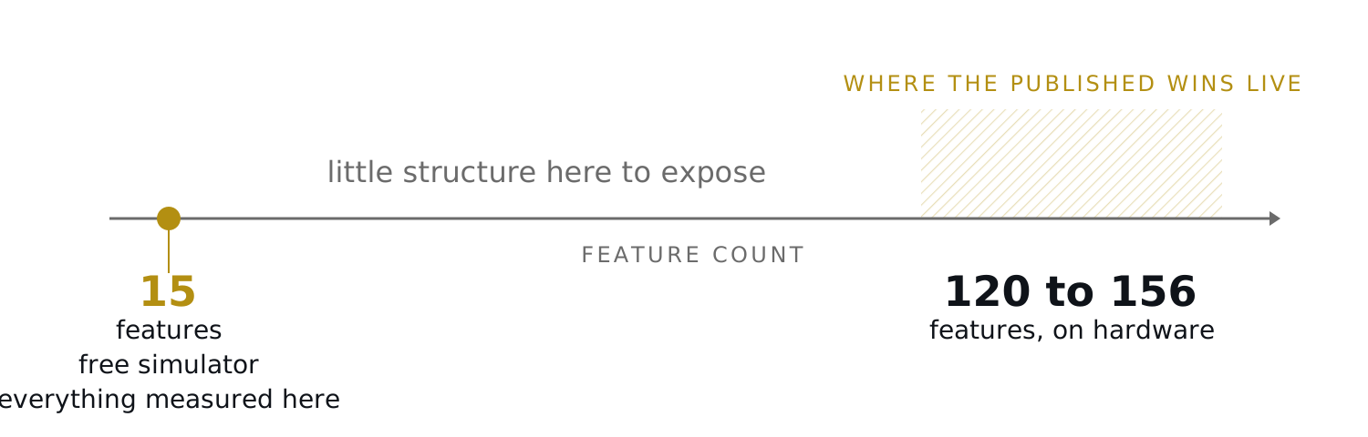
Feature width is the axis that separates our examples from the published wins. Our runs sit at nine to fifteen features; the published wins sit at 120 to 156 with similar sample counts. Rimay Simulator (free, hub.kipu-quantum.com) reaches 15 features and Rimay DQFE 133 to 156 features on IBM Heron processors with up to 20,000 samples. Those can then train surrogate models that help extract the gains and offer performance improvements on classical models and on premise. A functional map of features on a Heron QPU might look like this:
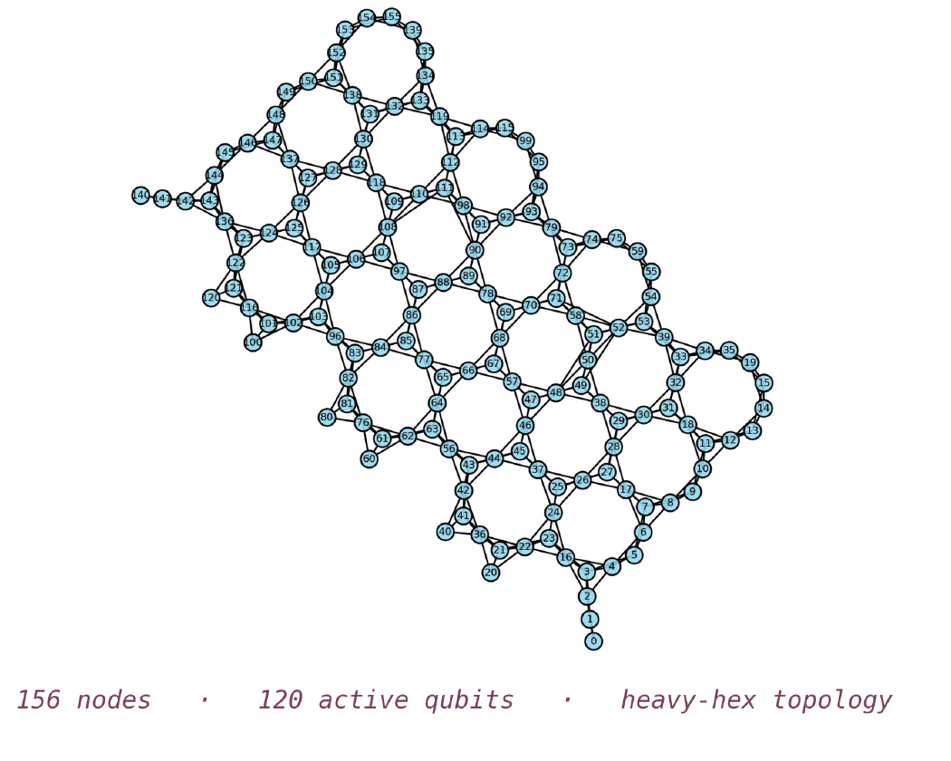
Two boundaries of this session. The first is the hardware. Presented results are all based on the free Rimay simulator from hub.kipu-quantum.com, and never a quantum processor. The published wins above come from research pipelines. The feature count limitation also applies to quantum computers, at a different scale: up to 156 features, and the measurements also depend on the hardware architecture. An example of how features might be distributed on the chip is shown above.
The second limitation is publicly available benchmarks. Due to the sensitivity of its applications, there are few published Rimay numbers on enterprise business records: like churn, payment delay, supplier risk. If your question is what this does on your dataset an experiment might have to be run, before coming to a conclusion. The simulator can give hints, but is not the full story.
The surrogate, and why serving stays classical
Regarding the promise of classical inference made in section two. Kipu's off-line framework runs the quantum processor over a representative sample of the training data during training. It is important that its distribution represents the full set, to then train a lightweight classical surrogate on the quantum data transformations. Once extracted, everything after that is classical: no quantum hardware queue at prediction time. Along with all its benefits: ordinary inference latency, ordinary MLOps cadence, on premise capability.
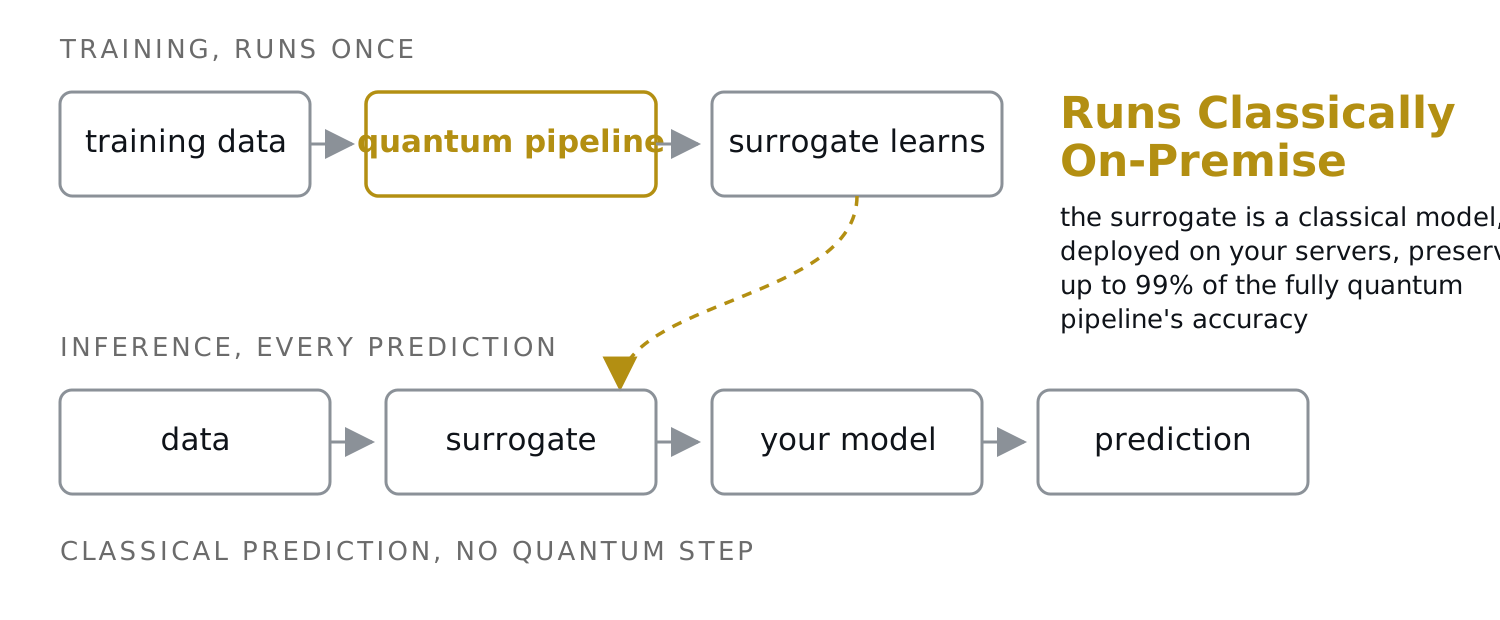
On the published satellite case, the classical surrogate reached the same 87 percent accuracy as the fully quantum pipeline with fivefold fewer quantum executions, from a 200-of-1,000 subsample (arXiv:2605.19801, preprint). Separately, on the breast ultrasound case the surrogate retained AUC 0.932 against the full pipeline's 0.937. Not all improvements can be captured at all times. What can go wrong during the subsample selection is creating bias or sparse, non-representative data that extrapolates badly. Inputs falling outside the covered region need to be flagged and accounted for.
Conclusion
Rimay offers an interesting choice for models that have stopped improving despite existing tuning efforts. At one additional tool-call it offers a lightweight and cheap addition to Machine Learning pipelines. As a ready-made service it allows Machine Learning practitioners easy and high-velocity experiments with quantum computing. Rimay's product page covers the service boundaries and details. If you are looking for optimization, session two, quantum optimization, covers the evidence for Kipu's quantum optimizers. The full curriculum is available via the Academy page.
quan·tum ma·chine learn·ing
/ˈkwɒn.təm məˈʃiːn ˈlɜː.nɪŋ/noun
- 1
the use of a quantum processor somewhere inside a machine-learning pipeline, whether to represent the data, to fit the model, or to make the prediction.
- 2
Rimay is the tool that computes the re-presented fit-transform structure of your data so that a model can act on it.